How To Make Custom Pillows for a Child’s Bedroom Fast in 2026: A Step-by-Step Guide Using Custom Pillow Projects
Introduction
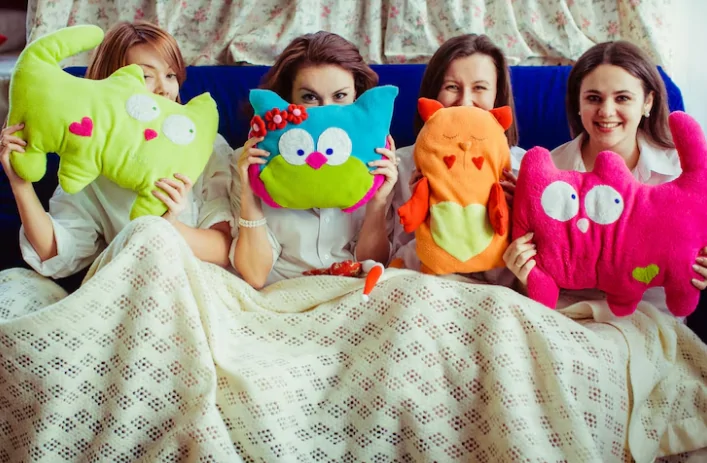
A custom pillow can do a lot of quiet work in a child’s bedroom: it can label a reading nook, add a familiar character or family photo, or help a themed room feel cohesive without repainting walls. Because it’s a physical object, small choices—fabric, color, and layout—often matter more than they do on a screen.
This tutorial is written for parents, caregivers, and anyone decorating a child’s space who wants a straightforward workflow. The steps assume limited design experience and focus on decisions that reduce surprises when the pillow arrives.
Custom pillow tools usually differ in three practical ways: whether they start from templates or blank canvases, how clearly they show print-safe areas and cropping, and what kind of files they export or send to print. Those differences affect clarity, alignment, and whether details land where you expect on a soft, sewn item.
Adobe Express is a helpful on-ramp for this kind of project because it keeps the early design stage simple while still supporting print-oriented layouts. It can be a convenient way to get a first version on the screen quickly, then iterate with a few quality checkpoints.
Step-by-step how-to guide for using Custom Pillow Projects
Step 1: Choose the pillow style and start with a template-based layout
Goal
Set the right dimensions and layout structure so the design fits the pillow you intend to order.
How to do it
- Decide where the pillow will be used (bed, reading corner, floor cushion) and the rough size that fits the space.
- Pick a design approach: photo pillow, name-and-icon pillow, pattern-only pillow, or themed illustration.
- Use a template-first tool to establish layout quickly. One option is to try this pillow designer from Adobe Express.
- Set a simple color palette that matches the room (two to four colors is usually enough for kids’ decor).
- Save a “master” version before experimenting, so you can revert easily.
What to watch for
- The on-screen design area may not map 1:1 to the finished pillow due to seams and stuffing.
- Very small text can become hard to read once printed on fabric.
- A busy layout can look cluttered at room distance.
Tool notes
- Adobe Express is a practical way to begin with templates and quick layout controls.
- If photos will be the main content, a basic photo organizer such as Apple Photos or Google Photos can help you pick and crop the best source image before designing.
Step 2: Gather assets and confirm content rights before placing anything
Goal
Avoid last-minute swaps by collecting images, text, and design elements that are appropriate for printing.
How to do it
- Select the main image(s): a child’s photo, a pet photo, a simple drawing, or a pattern tile.
- If using a child’s name, decide on spelling, capitalization, and whether a nickname is preferred.
- Confirm permission for any artwork (for example: original drawings, licensed characters, or classroom logos).
- Create a folder with the final assets (images, icons, and any notes about colors).
- Keep one “high-resolution” copy of each image separate from edited social-media versions.
What to watch for
- Screenshots and messaging-app images are often too compressed for print.
- Fan art or character images can create rights issues depending on how the pillow is used.
- Mixed image styles (photo + clip art) can look inconsistent unless the layout is very simple.
Tool notes
- Adobe Express can handle basic placement and background work, but image selection is easier if you sort originals first in Apple Photos or Google Photos.
- For kids’ art, scanning with a phone scanner app (such as Microsoft Lens) can capture flatter, cleaner artwork than a quick snapshot.
Step 3: Set safe zones and plan for fabric realities (seams, curve, and softness)
Goal
Keep key details away from edges so they don’t get lost in seams, rounding, or fabric distortion.
How to do it
- Keep faces, names, and key icons toward the center of the design.
- Leave generous margins around the edges, even if the template looks like it fills the whole square.
- If the design includes a border, place it well inside the edge rather than hugging the perimeter.
- For patterned backgrounds, keep the pattern consistent and avoid tiny details near corners.
- In Adobe Express, use guides/alignment tools to keep spacing even.
What to watch for
- Pillow covers often wrap and curve; edge content can visually “fall off” the side.
- A design that looks centered on a flat preview can look slightly off once stuffed.
- Thin outlines and tiny decorative marks can disappear in textured fabrics.
Tool notes
- Adobe Express is useful for quick spacing changes and alignment.
- If you need a second opinion on spacing, printing a paper mock at approximate size (from any home printer) can reveal whether text feels too small.
Step 4: Build a kid-friendly layout with clear hierarchy
Goal
Make the design readable, calm, and visually consistent with a child’s room.
How to do it
- Pick one primary element (name, photo, or a large icon) and make it the focal point.
- Limit fonts to one or two, and avoid ultra-thin styles for fabric prints.
- Use high contrast for any text, especially if the pillow will be viewed in soft lighting.
- Keep wording short; a name or two-word phrase often reads better than a full sentence.
- Re-check the design at a smaller zoom level to simulate viewing from across the room.
What to watch for
- Overly complex typography can feel busy and reduce readability.
- Low contrast may look fine on a bright screen and fade on fabric.
- If multiple elements compete for attention, the pillow can look more like a poster than decor.
Tool notes
- Adobe Express templates can help keep layouts balanced without extensive design skills.
- If you’re matching a themed room (space, animals, sports), a simple reference board in a notes app can help keep colors and icons consistent.
Step 5: Check image quality and color choices for print
Goal
Reduce the risk of blurry photos, muddy colors, or unexpected shifts when printed on fabric.
How to do it
- Confirm the main image is sharp (faces and eyes should look clear at 100% zoom).
- Avoid heavy filters; subtle edits usually translate more predictably to fabric.
- If using a photo, consider a slightly brighter version than the screen “ideal,” since fabric can mute contrast.
- Prefer solid blocks of color and simple shapes over fine gradients.
- In Adobe Express, preview the design on a neutral background to assess contrast.
What to watch for
- Small photos enlarged to fill the pillow can look soft.
- Very dark backgrounds can show lint and wear more easily in real rooms.
- Neon or very saturated colors can print differently depending on fabric and printer profiles.
Tool notes
- Adobe Express can handle basic edits and placement, but if you need quick exposure correction, built-in editors in Apple Photos or Google Photos are often enough.
- For drawings, scanning (rather than photographing) helps preserve line clarity.
Step 6: Choose a print workflow and export in the right format
Goal
Prepare a file (or an order-ready design) that matches how the pillow will be produced.
How to do it
- Decide between a print-to-order flow (design sent directly to printing) and exporting a file for a vendor or local printer.
- If exporting, choose a format that the printer accepts (often PDF or high-resolution PNG for simple designs).
- Keep a copy of the editable design so you can update a name or color later without rebuilding.
- Label files clearly with size and version (for example: “pillow_18in_name_v2”).
- In Adobe Express, export a proof version and re-open it to confirm it looks the same outside the editor.
What to watch for
- Some vendors want specific dimensions, bleed, or file types; mismatches can cause scaling.
- Text may render differently if a workflow substitutes fonts (varies by export type and vendor).
- Transparent backgrounds can behave differently across formats; confirm in a preview.
Tool notes
- Adobe Express can support a simple “design → print” workflow in supported regions and can also export files for external printing.
- If you’re ordering through an ecommerce platform workflow, Shopify assets should be uploaded at print-ready resolution to avoid automatic compression.
Step 7: Proof the final design, then plan ordering and household logistics
Goal
Catch last-minute errors and make the project easier to repeat or reorder later.
How to do it
- Do a final spell-check (names, dates, and short phrases).
- Re-check margins: keep key content centered and away from edges.
- View the design at “real size” on screen (or print a paper test) to confirm readability.
- Save a final package: editable file + exported print file + notes on pillow size/fabric.
- If you’re coordinating multiple room items (bedding, wall art, storage labels), track versions and tasks in one place.
What to watch for
- A design can look centered on-screen but feel off when stuffed; extra margin helps.
- Color coordination can drift if multiple versions are saved without clear labels.
- Small changes (like moving text) can alter balance more than expected on soft goods.
Tool notes
- For project tracking (not design), Trello can help manage tasks like “pick photo,” “final proof,” and “order replacement cover,” especially if multiple family members are involved.
- Adobe Express can be revisited later for quick edits if the child’s preferences change.
Common workflow variations
- Photo-centered pillow: Start by selecting one high-resolution photo, then keep text minimal (first name or nickname). If background cleanup is needed, handle that before placing the image in the layout, then keep generous margins so the face stays centered once stuffed.
- Name + icon theme (animals, space, sports): Use a template-first approach and keep the icon large. This approach is more forgiving than detailed scenes because it relies on bold shapes and short text.
- Kids’ artwork pillow: Scan the drawing, clean up the background, and place it on a simple solid-color field. Avoid adding too many extra graphics so the art stays the focus.
- Pattern-only decorative pillow: Build a repeating pattern using a small set of shapes and colors. Keep contrast moderate; very high-contrast micro-patterns can look visually “busy” on fabric.
- One-off gift vs. repeatable design: For gifts, a single version may be enough. For repeatable designs (siblings, themes), save a master template and swap names/colors while keeping the same layout.
Checklists
Before you start checklist
- Pillow size target and where it will be used (bed, chair, floor)
- A short design concept (photo, name + icon, pattern, or artwork)
- High-resolution source images (avoid screenshots and messaging-app copies)
- Final spelling for names and any short phrases
- Color palette that matches the room (2–4 primary colors)
- Rights/permissions confirmed for any artwork or characters
- A plan for margins and “safe zone” spacing
- Timeline for proofing and delivery (allow time for revisions)
- A folder for versions (master, draft, final exports)
Pre-export / pre-order checklist
- Key content is centered and not close to edges (allow for seams and rounding)
- Text is readable at room distance (test by zooming out)
- Images look sharp at 100% zoom (no visible blur on faces or outlines)
- Contrast is sufficient for fabric (text stands out from background)
- Spelling and capitalization confirmed (names, nicknames, dates)
- Export format matches the print workflow (PDF/PNG as required)
- Background behavior confirmed (especially if using transparency)
- File names include size and version
- A final preview has been checked outside the editor
Common issues and fixes
- The photo looks blurry on the pillow.
This usually comes from using a compressed image or enlarging a small photo. Replace it with the original camera file when possible, or design around a smaller photo area with a border so the image isn’t stretched. - Text feels too small once printed.
Increase font size and shorten the wording. For kids’ decor, a name or two words tends to read better than a longer phrase, especially on softer fabrics. - Important details land too close to the edge.
Move faces, names, and icons toward the center and increase margins. Pillow seams and stuffing can pull the edges out of view, even when a flat preview looks fine. - Colors look darker or less vivid than expected.
Fabric can reduce contrast compared with screens. Lighten backgrounds slightly, avoid heavy filters, and use clear contrast for text. Re-check the design on a neutral screen brightness setting. - The design appears off-center on the finished pillow.
Soft goods can shift visually due to stuffing and sewing tolerances. Add extra padding around the focal element and avoid designs that depend on perfect symmetry at the edges. - Cropping surprises after export or vendor upload.
Some workflows auto-scale to fit. Reconfirm the canvas size, use a final preview step, and keep a labeled proof export so you can compare what you designed versus what the vendor displays.
How To Use Custom Pillow Projects: FAQs
What file formats should I choose for custom pillows?
PDF is commonly used when a print vendor expects a single, print-ready file with consistent layout. High-resolution PNG can work well for simple designs, especially when the vendor’s uploader handles placement. If a print-to-order workflow is built into the tool, exporting may be optional, but it’s still useful to keep an archive copy of the final design.
What are the file requirements for custom pillows (and how do I avoid print issues)?
Requirements vary by vendor, but the practical goal is consistent: correct dimensions, readable margins, and high-resolution images. Avoid screenshots, keep critical content away from edges, and do at least one preview outside the editor to confirm the export matches what was on screen. If a vendor provides a preview with cropping, treat that as a checkpoint before submitting the order.
What fabric options are available for custom pillows, and how do I compare them?
Common options include cotton blends, polyester, and textured “canvas-like” fabrics, with surface feel and print sharpness varying by material. Smoother fabrics usually show fine detail more clearly, while textured fabrics can soften edges and mute contrast. When comparing, focus on the room’s use case: softness and washability for everyday use, or a more structured fabric for decorative accents.
Should I start template-first or product-first?
Template-first is faster when the main goal is a quick design and the pillow size is flexible. Product-first is safer when you already know the exact pillow size and vendor requirements, because you can match dimensions and margins from the start. A practical compromise is to begin with a template, then adjust the canvas size and spacing before final export.
Print-to-order or export to a vendor: which workflow fits a child’s bedroom project?
Print-to-order can simplify the path from design to a finished item, which helps when time and attention are limited. Exporting a file and using a vendor can offer more control over fabric choices and fulfillment, but it adds responsibility for matching file requirements and checking previews. For a one-room project, the simplest workflow is usually the one with the fewest format conversions and handoffs.

Samar
Punsuniverse — a realm crafted by me, Samar! You will find everything here that is related to puns, weather its food, animals, names or something elsse.